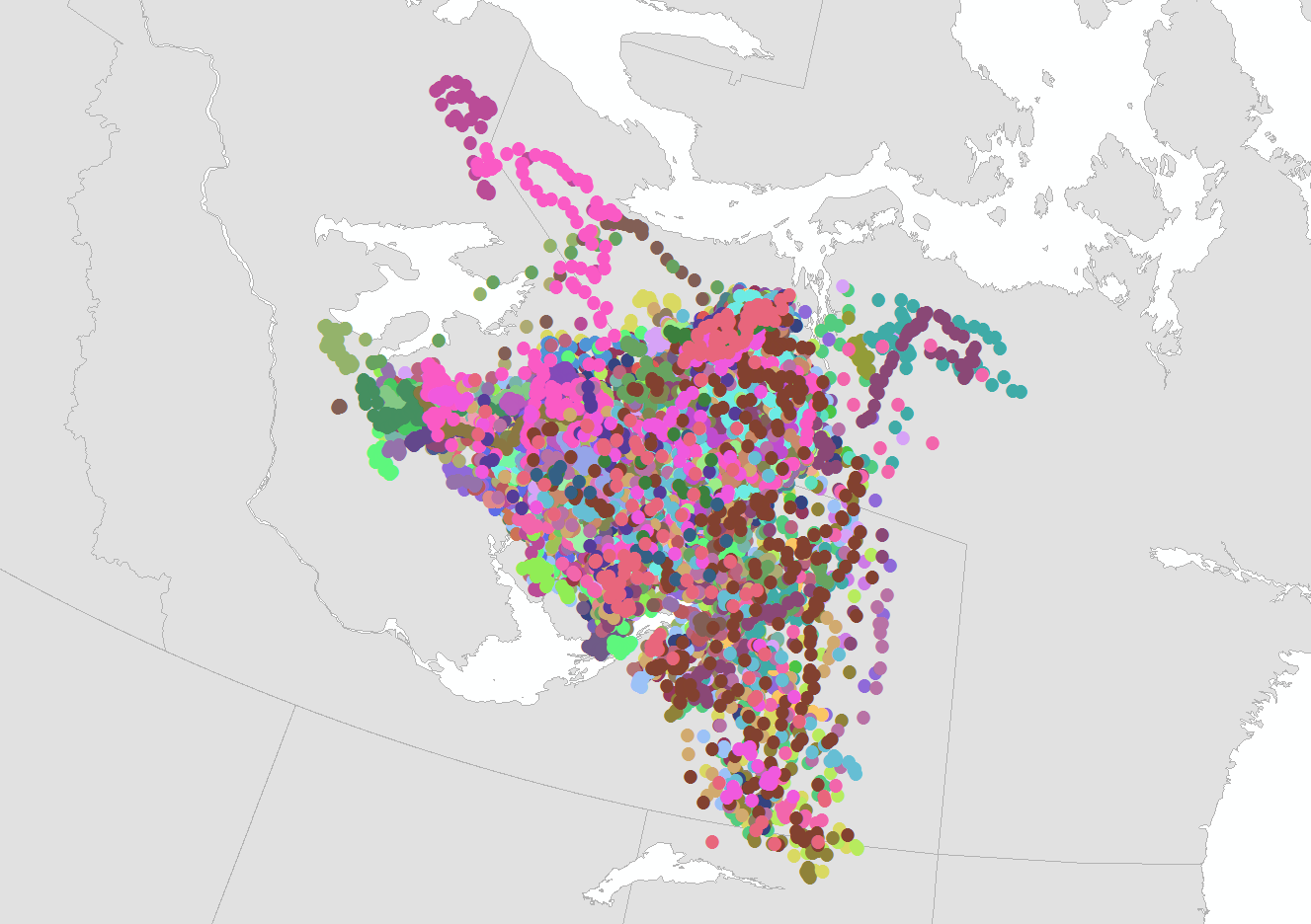
Caribou Migration Animation in Google Earth
Google Earth allows for the time-linking of data. By scrubbing a time-control slider back and forth, a user can see how data changes over time. This is a significant improvement, allowing us to go beyond “where” and “how much” and to begin to tell three dimensional stories about flow and dynamics, which gets us closer to “why” and “what will happen”.
Damian Panayi of Golder & Associates saw the potential of telling the story of the migration of the Bathurst Caribou Herd, using data painstakingly collected over many years by satellite-linked GPS collars. It’s a huge and very cool dataset.
I brought the data into Google Earth, and established the time linkages, but it was jerky and hard to follow due to inconsistencies in the timing of locations. So I developed a method to create interpolated “ghost” locations in between the real ones, smoothing out the flow. I also made a second version of the data, collapsing many years of migrations into a single virtual year, making clear the changes in migration patterns over the years.
In the end it was a huge dataset — several million lines of KML code! But the results are compelling, and are now in use in the curriculum of the NWT Ministry of Education, Tourism and Culture.

