GIS Art from Landscape Biodiversity Project

I’m working on a fun project for the BC Forest Practices Board. We’re taking great whackloads of province-wide spatial data and transmogrifying it into handy reports on the physical status of forests in different administrative and ecological zones. And I’m pleased to report that the project is beginning to produce some GIS art.

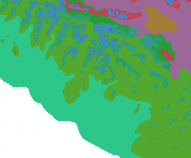
biogeoclimactic zones around Port Alberni

GIS art, for those who haven’t had the pleasure, are the serendipitous bits of aesthetic map flotsam that tend to pop up as intermediary products in geographic analysis chains. They’re the recombinant product of the natural attractiveness of landforms, the semi-random automated assignment of colours to landcover classes, and the quasi-organic distortions introduced by algorithm. The above is a relatively unprocessed version, see for comparison one of my old favourites:
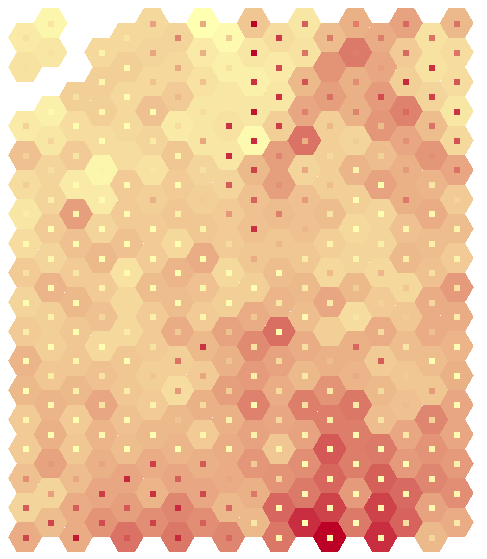

localized explanatory power of soil water for shapeness
of juniper, Strawberry Crater, Waputki AZ

OK, so maybe it’s not great art. But when GIS art does show up, it’s often a nicely timed distraction from the more abstract “pleasures” of analytical troubleshooting.
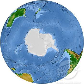
A Vegetation Map of the Antarctic

The actual title is “A Vegetation Map of the Southern Hemisphere”. For sale here. Nice palette, but not the projection I would have chosen.

The Natural Earth Dataset Is Online

I was working on a mapping project, and I was frustrated that I couldn’t find basic shoreline data for the Great Lakes. You wouldn’t think it would be hard to get something as simple as an outline of the most famous fresh water in the world, but it is: Geobase.ca for instance only covers half of the lakes because Geobase stops where Canada stops. Even if Geobase were international in scope, the National Hydro dataset on offer is insanely detailed and would have to be mosaiced and filtered and smoothed and generalized before being used to make a regional-scale map. Alternatively, there are a few clunky world baselayers floating around, but zoomed into a regional scale they look like they were digitized by an intern in a hurry. finder.geocommons.com (bless ’em) has all kinds of interesting specialized products — Fishing Special Regulation Lakes in Pennsylvania for instance — but not just, you know, a decent map of all the lakes.

Nor is this an unusual problem. General basemap data is rare. High quality, consistent, freely available, freely publishable basemap data is even rarer. Quality, consistent, usable basemap data that is predictably findable is gold. ESRI gives away some low-res, somewhat inconsistent free data, and will sell you a pretty comprehensive set of higher quality stuff. But in my expereience the quality of even the paid data varies like crazy from jurisdiction to jurisdiction, and often doesn’t match up at the borders. Each mapper I know has a little stash of their favourite basemaps, and sometimes they will get traded around, and sometimes they won’t. And that still doesn’t solve your problem if you’re trying to make a map that looks consistent across multiple provinces or states or countries.

(I should point out that normally, access to Great Lakes would be an exception, since gis.glin.net is a good GIS source. But they’re broken these days).

If you want a nice tinted relief map of the world, that at least has been available thanks to the work and generosity of Tom Patterson, USGS cartographer and acknowledged master of shaded relief and naturalistic cartography. And for a while there have been hints that Tom was participating in a new project that would release a broader set of basemap data, including high-quality vector data as well as raster layers. Wouldn’t that be a thing!

So I decided to check in on the progress of that project. And lo, it has been released! Since last week! Natural Earth is online and distributing data.

What’s in there? An extraordinary cartographical toolkit — physical and cultural, hand-generalized to 3 different useful scales. Checked for accuracy and consistency. Comprehensive across the world. With an active infrastructure for gathering reported errors and plans to revise and rerelease improved iterations. Free as in beer, free as in speech. You don’t even have to sign in. And as if all that wasn’t enough, Tom Patterson seems to have included a new portfolio of shaded relief layers, including some gorgeous hypsometric tinted landcover representations.

In addition to Tom, the other driving collaborator seems to be one Nathaniel Kelso, someone I didn’t know of but who works for the Washington Post. Apparently the kernel of the vector side of Natural Earth is a dataset the Washington Post had assembled for quick-turn-around diagramatic cartography. I’m not quite clear on the funding of the project, but as far as I can tell the motivation is sheer good will. It’s an unexpected and extremely promising cartography resource.