Roll Your Own Rosling-esque Statistical Visualizations

It’s a statistical certainty that you watched Hans Rosling’s extraordinary information visualization presentation, from back when TED talks were cool. If not, you should certainly watch it below, as well as all the triumphant sequels.

And now, courtesy of Google, an experimental interface for rolling your own Rosling-esque statistical displays. Below is one of the examples they offer, slightly customized by me, but you can start from scratch and cook up anything you want from the datasets they have on hand.

The interface for assigning variables to axes and symbolism is fantastic. It’s reminds me of the Hectares BC approach. (Which reminds me in turn of the wonderful and neglected JMP exploratory stats package.) Complicated interfaces are great when you know what you want and want to be able to get it no matter how complicated it is, but a simpler interface allows for faster experimentation.

I hope they expand the amount of data, and I’m sure they will. I also hope they allow for cross-tabbing data from disparate data sets: for now you can only correlate numbers from the World Development Indicators with other WDI numbers, for instance.

We’re increasingly seeing numerical and geographical information displays which explicitly incorporate time, and Google is a big part of that. I’m a big fan of that trend towards explicit temporality — it helps take the focus off stocks and onto flows, and makes casually it clear that baselines really do shift.
Obama Appoints Edward Tufte to Increase Stimulus Transparency

Sounds kind of like an Onion headline. But also sounds like a good idea.

The stimulus and associated bank bailouts were almost certainly absolutely necessary. We will never know, because we can’t run the experiment again. The implementation of the American stimulus seems to have been mismanaged by some criteria. We should know about that, but it’s hard, because transparency is one of the criteria it seems to be failing on. Perhaps Tufte will help us with that.

Visualizing the New York Times, for Example

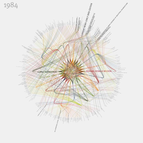
I wanted to post about these amazing visualizations of links between people and organizations in the New York Times. But in the course of looking up their author I discovered that almost everything he creates is that or more amazing, which makes it difficult to choose one example to highlight. Nonetheless, here’s the 1984 version of the NYT viz:

NYTimes: 365/360 - 1984 (in color)

Check it out large, or see the whole set.

Jer Thorp apparently works by visualizing the output of data mining executed on publicly available data streams. He mostly uses Processing to do it, which he calls “an electronic sketchbook for developing ideas”. Interesting. Using information techniques to digest and synergize the increasing amount of public (spatial) data sets is becoming a natural part of GIS, and if I were a more ambitious programmer I might be inspired by this stuff to try and use Processing in a spatial context.

(Also, he appears to have good taste in neighbourhoods.)