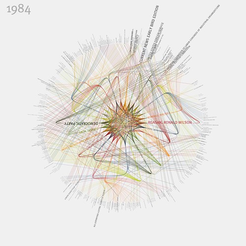
Visualizing the New York Times, for Example
I wanted to post about these amazing visualizations of links between people and organizations in the New York Times. But in the course of looking up their author I discovered that almost everything he creates is that or more amazing, which makes it difficult to choose one example to highlight. Nonetheless, here’s the 1984 version of the NYT viz:
Check it out large, or see the whole set.
Jer Thorp apparently works by visualizing the output of data mining executed on publicly available data streams. He mostly uses Processing to do it, which he calls “an electronic sketchbook for developing ideas”. Interesting. Using information techniques to digest and synergize the increasing amount of public (spatial) data sets is becoming a natural part of GIS, and if I were a more ambitious programmer I might be inspired by this stuff to try and use Processing in a spatial context.
(Also, he appears to have good taste in neighbourhoods.)
