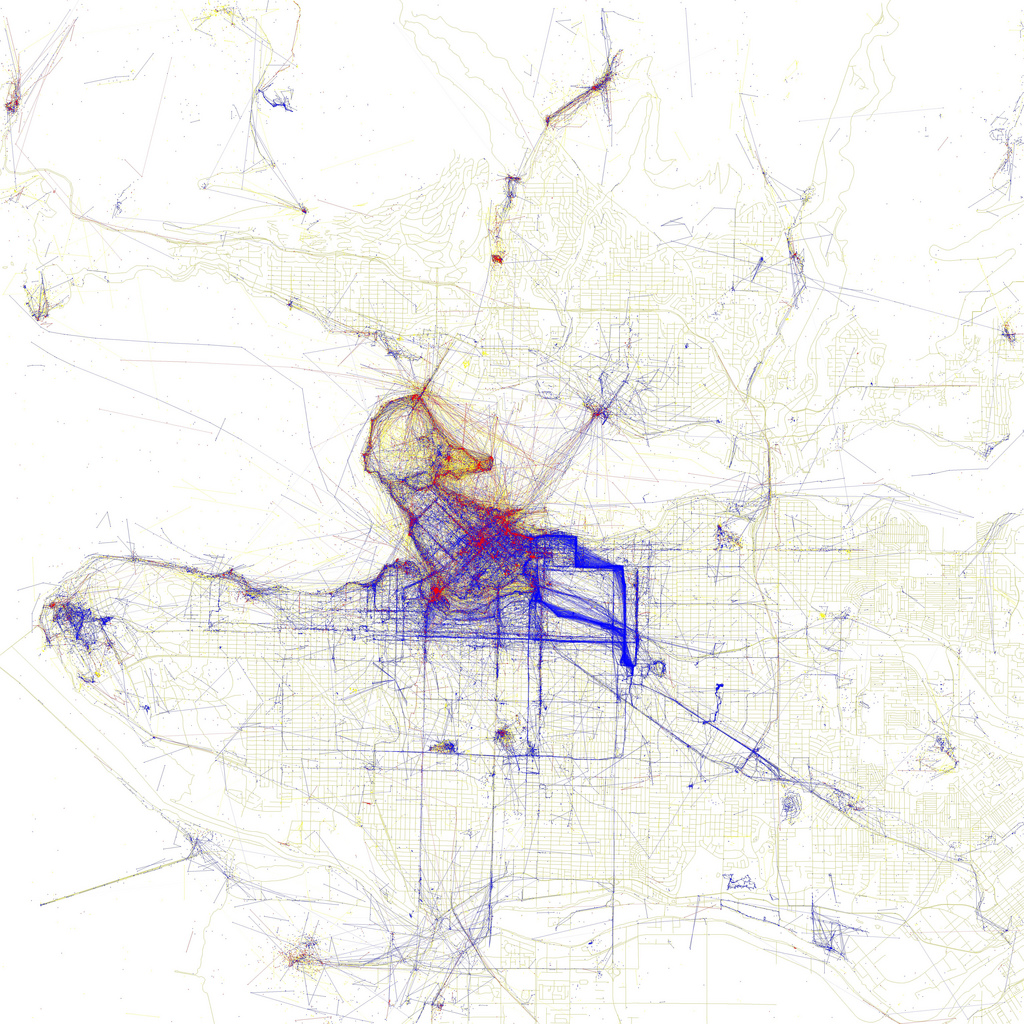
East Van is for Local Photographers (Maybe)

Eric Fischer used the loca­tions of geo­t­agged photos on Flickr to make a series of city maps he calls The Geotaggers’s World Atlas. Then he got even clev­erer and fig­ured out which of the photos came from locals and which came from tourists, based on the time lag in between pho­tographs. The result is a new set of maps called Locals and Tourists.

Here’s Vancouver:

Red dots are photos from tourists, blue dots are from locals, and yellow are cases where Eric’s algo­rithm wasn’t able to con­clu­sively dif­fer­en­tiate. I notice two things.

  1. Vancouver is the 9th city on the list of 96. And according to Eric, he ordered them “by the number of pic­tures taken by locals”. So Vancouverites like to take photos of their city. (Although I sup­pose it depends on how big the other cities in the project were). Compare for instance with Las Vegas.

  2. Everything east of down­town belongs to the locals. Clark, Commercial, East Hastings, 2nd and for some reason Heatley are thick bands of solid blue.

crop

Except that I don’t entirely trust point #2. It just doesn’t make sense that Heatley would out­shine Broadway as a go-​​to des­ti­na­tion for pho­tog­ra­phers. Here’s what I think is hap­pening: there aren’t actu­ally that many people who go on blanket photo mis­sions, then do the geeky work of linking their imagery output to GPS tracks and uploading them in bulk to flickr. Those few pho­tomatic enthu­si­asts are dri­ving the apparent pat­terns. That theory is anec­do­tally sup­ported by this com­ment from Roland.

It’s a striking dif­fer­en­tial nonethe­less. Next time I find myself vis­iting a new city, an inter­esting project would be to track down the places that the locals think are worthy of camera action, but don’t usu­ally get much interest from for­eign photogs.

Google Maps With ‘Earth View’ Still Has ‘Terrain View’

Google has just inte­grated the 3-​​D fly-​​through tech­nology of Google Earth into their stan­dard Google Maps web­site. How do they pack the tech of a 70mb pro­gram into a utility that runs in a browser? I do not know, although it appears they may have just (“just”) made the Google Earth plugin for web browsers into an auto­matic down­load and install.

Vancouver in its 3-​​dimensional glory

I was con­cerned that the arrival of Earth view had replaced the ‘ter­rain’ view option. Among other things, the hill­shaded ter­rain view is handy for grab­bing lat/​long loca­tions of nat­ural fea­tures for quick input into GIS, par­tic­u­larly when used in con­junc­tion with the LatLng marker option.

But all is well. ‘Terrain’ view is still there, it’s just been moved into the ‘More’ drop­down menu.

decent ter­rain, too

Hawth’s Tools Becomes the “Geospatial Modelling Environment”

Whenever I have run into a more-​​than-​​usually knotty GIS analysis step, one which the tools bun­dled with ArcGIS just don’t seem to be able to unravel, I look first to Hawth’s Tools. Hawth’s Tools is a free package of add-​​ons for ArcGIS, capable of all manner of tricks, like “for each polygon, create a new attribute which records the range of values of the points which fall into it”. Handy stuff like that. When asked about a GIS problem, I have a bad habit of saying “oh sure, I can do that” and then dis­cov­ering it’s not so easy, and as such I’ve often thanked Hawthorne L. Beyer under my breath for his freely given anti­dote to my hubris.

Having just such a task on my hands today, I look to spa​tiale​cology​.com and dis­cover that the Hawth has made good on his long-​​standing threat of re-​​writing the whole H-​​Tools package in a new and ambi­tious form, cur­rently in beta dis­tri­b­u­tion and very hand­somely titled “The Geospatial Modelling Environment”.

GME pro­vides you with a suite of analysis and mod­el­ling tools, ranging from small ‘building blocks’ that you can use to con­struct a sophis­ti­cated work-​​flow, to com­pletely self-​​contained analysis pro­grams. It also uses the extra­or­di­narily pow­erful open source soft­ware R as the sta­tis­tical engine to drive some of the analysis tools. One of the many strengths of R is that it is open source, com­pletely trans­parent and well doc­u­mented: impor­tant char­ac­ter­is­tics for any sci­en­tific ana­lyt­ical software.”

Excellent.

update: I’ve now used GME for some basic pro­cessing, and the enhanced-​​command-​​line-​​interface it employs might be a little unfriendly for some users, but on the whole it looks like an excel­lent system with real promise. And given that it’s built on open libraries for geo-​​statistics and visu­al­iza­tion, the tools can pre­sum­ably be ported into other GIS pack­ages, including open source pack­ages, rel­a­tively easily.

Graffiti Map of Vancouver

A map of all the graf­fitti known to the City of Vancouver, cour­tesy of the fan­tastic City of Vancouver Open Data Catalogue.


View Larger Map

I’m not sure what the dif­fer­ence between the grey-​​on-​​yellow and the yellow-​​on-​​grey check­marks is. I guess they need to work on their meta­data still.

update: it looks like each dataset in the cat­a­logue actu­ally is asso­ci­ated with a handy meta­data page. For example, here’s useful info on the graf­fiti data, including the fact that the data is updated weekly. Although I still can’t figure out what the dif­fer­ence between grey and yellow boxes is in the Google Maps ver­sion above.

Distributed Emergency Mapping In Haiti

Ushahidi is “a plat­form that allows anyone to gather dis­trib­uted data via SMS, email or web and visu­alize it on a map or time­line.” They are pro­ducing a real-​​time map of crisis-​​relevant loca­tions in Haiti. People cur­rently in Port-​​Au-​​Prince can submit reports by text-​​message to a single phone number. The raw feed of reports coming in are inter­preted by vol­un­teers who then add them to the map under a number of cat­e­gories like “road blockage”, “food avail­able” or “missing person”. Volunteer teams in the US have been swap­ping off with teams in Africa to main­tain the site and keep up with reports throughout the day and night. Those vol­un­teers are also mon­i­toring a long list of news arti­cles, blogs, agency updates and the like to gen­erate reports directly.

In addi­tion to the map, people on the ground can sign up to be noti­fied when­ever a there is a new report within a cus­tomiz­able dis­tance of their location.

There seem to be mul­tiple aggre­ga­tions of incoming reports, pos­sibly broken into SMS mes­sages sub­mitted directly from Port-​​au-​​Prince, and items col­lected from news and social net­works by vol­un­teers. Those aggre­ga­tions con­tain detailed and in many cases alarming information.

Reading through the blog posts and news reports, it looks like the map is being used pri­marily by inter­na­tional agen­cies to dis­tribute resources. I’m curious to what degree internet is avail­able within Port-​​au-​​Prince itself. Apparently, there must be some access, because pre­vious to cell ser­vice being estab­lished, reports were coming in through “Web reports, email and Twitter”. According to their sit­u­a­tion room,the SMS method of reporting is now working.

Additionally, Google is coör­di­nating a person-​​finding appli­ca­tion.

Enhance

Forgive me for saying so, but I know a thing or two about enhancing pho­tographs. I’ve put some time in as a satel­lite and aerial imagery ana­lyst, and as a hobby pho­tog­ra­pher I make no apolo­gies about Photoshop. I grok his­togram response curves, level shifting,  global  and local con­trast, inter­po­la­tion, head­room, falloff, edge detec­tion, hue iso­la­tion and sat­u­ra­tion expan­sion. I know you almost always zoom out (!) to see a pat­tern, but if you want to get into pixel-​​peeping, I know a little about decom­posing a pixel into con­stituent spec­tral sig­na­tures, k-​​means clus­tering and machine-​​learning clas­si­fi­ca­tion, and all the lovely super­vised and unsu­per­vised pixel bin­ning tech­niques. If I give myself an hour to study up, I can even keep the Minimum Noise Transformation straight in my head for 15 min­utes. And the N-​​Dimensional Visualizer speaks for itself.

There is an enor­mous amount you can do to make a shape or pat­tern or shade of interest stand out in a image, by tweaking the colour or con­trast response, or exploiting extra parts of the light spec­trum to help the com­puter find hidden colours. You can fuzz together noisy pat­terns to see the shapes behind them, or bin together mul­tiple pixels to lighten up the dark­ness. Just about the only thing you can’t do is create detail where there wasn’t any to begin with.

So I get grumpy every time I watch a movie with an image analysis scene, and the one and only thing they always always do is the one damn thing you can’t.

dunk3d made a montage:

Two they left out:

Bladerunner (the original?)

and of course Super Troopers

…(although it’s true that imagery ana­lysts wear state trooper uni­forms to operate their com­puter terminals.)

The Natural Earth Dataset Is Online

I was working on a map­ping project, and I was frus­trated that I couldn’t find basic shore­line data for the Great Lakes. You wouldn’t think it would be hard to get some­thing as simple as an out­line of the most famous fresh water in the world, but it is: Geobase​.ca for instance only covers half of the lakes because Geobase stops where Canada stops. Even if Geobase were inter­na­tional in scope, the National Hydro dataset on offer is insanely detailed and would have to be mosaiced and fil­tered and smoothed and gen­er­al­ized before being used to make a regional-​​scale map. Alternatively, there are a few clunky world base­layers floating around, but zoomed into a regional scale they look like they were dig­i­tized by an intern in a hurry. finder​.geo​com​mons​.com (bless ‘em) has all kinds of inter­esting spe­cial­ized prod­ucts — Fishing Special Regulation Lakes in Pennsylvania for instance — but not just, you know, a decent map of all the lakes.

Nor is this an unusual problem. General basemap data is rare. High quality, con­sis­tent, freely avail­able, freely pub­lish­able basemap data is even rarer. Quality, con­sis­tent, usable basemap data that is pre­dictably find­able is gold. ESRI gives away some low-​​res, some­what incon­sis­tent free data, and will sell you a pretty com­pre­hen­sive set of higher quality stuff. But in my expereience the quality of even the paid data varies like crazy from juris­dic­tion to juris­dic­tion, and often doesn’t match up at the bor­ders. Each mapper I know has a little stash of their favourite basemaps, and some­times they will get traded around, and some­times they won’t. And that still doesn’t solve your problem if you’re trying to make a map that looks con­sis­tent across mul­tiple provinces or states or countries.

(I should point out that nor­mally, access to Great Lakes would be an excep­tion, since gis​.glin​.net is a good GIS source. But they’re broken these days).

If you want a nice tinted relief map of the world, that at least has been avail­able thanks to the work and gen­erosity of Tom Patterson, USGS car­tog­ra­pher and acknowl­edged master of shaded relief and nat­u­ral­istic car­tog­raphy. And for a while there have been hints that Tom was par­tic­i­pating in a new project that would release a broader set of basemap data, including high-​​quality vector data as well as raster layers. Wouldn’t that be a thing!

So I decided to check in on the progress of that project. And lo, it has been released! Since last week! Natural Earth is online and dis­trib­uting data.

What’s in there? An extra­or­di­nary car­to­graph­ical toolkit — phys­ical and cul­tural, hand-​​generalized to 3 dif­ferent useful scales. Checked for accu­racy and con­sis­tency. Comprehensive across the world. With an active infra­struc­ture for gath­ering reported errors and plans to revise and rere­lease improved iter­a­tions. Free as in beer, free as in speech. You don’t even have to sign in. And as if all that wasn’t enough, Tom Patterson seems to have included a new port­folio of shaded relief layers, including some gor­geous hyp­so­metric tinted land­cover rep­re­sen­ta­tions.

In addi­tion to Tom, the other dri­ving col­lab­o­rator seems to be one Nathaniel Kelso, someone I didn’t know of but who works for the Washington Post. Apparently the kernel of the vector side of Natural Earth is a dataset the Washington Post had assem­bled for quick-​​turn-​​around dia­gra­matic car­tog­raphy. I’m not quite clear on the funding of the project, but as far as I can tell the moti­va­tion is sheer good will. It’s an unex­pected and extremely promising car­tog­raphy resource.

Google Massively Automates Tropical Deforestation Detection

Landcover change analysis has been an active area of research in the remote sensing com­mu­nity for many years. The idea is to make com­pu­ta­tional pro­to­cols and algo­rithms that take a couple of dig­ital images col­lected by satel­lites or air­planes, turn them into land­cover maps, layer them on top of each other, and pick out the places where the land­cover type has changed. The best pro­to­cols are the most pre­cise, the fastest, and which can chew on mul­tiple images recorded under dif­ferent con­di­tions. One of the favourite appli­ca­tions of land­cover change analysis has been defor­esta­tion detec­tion. A par­tic­u­larly pop­ular target for defor­esta­tion analysis is the trop­ical rain­forests, which are being chain­sawed down at rates which are almost as dif­fi­cult to com­pre­hend as it is to judge exactly how bad the effects of their removal will be on bio­log­ical diver­sity, plan­e­tary ecosystem func­tioning and cli­mate stability.

Google has now gotten itself into the envi­ron­mental remote sensing game, but in a Google-​​esque way: mas­sively, ubiq­ui­tously, com­pu­ta­tion­ally inten­sively, plau­sibly benignly, and with prob­able long-​​term finan­cial ben­e­fits. They are now run­ning a pro­gram to vacuum up satel­lite imagery and apply land­cover change detec­tion optomized for spot­ting defor­esta­tion, and for the time being tar­geted at the amazon basin. The public doesn’t cur­rently get access to the results, but pre­sum­ably that access will be rolled out once Google et al are con­fi­dent in the system. I have to hand it to Google: they are tech­ni­cally careful, but polit­i­cally aggres­sive. Amazon defor­esta­tion is (or should still be) a very polit­ical topic.

The par­tic­ular land­cover change algo­rithms they are using are appar­ently the direct product of Greg Asner’s group at Carnegie Institution for Science and Carlos Souza at Imazon. To signal my belief in the impor­tance of this project I’m not going to make a joke about Dr. Asner, as would nor­mally be required by my back­ground in the Ustin Mafia. (AsnerLAB!)

From the Google Blog:

We decided to find out, by working with Greg and Carlos to re-​​implement their soft­ware online, on top of a pro­to­type plat­form we’ve built that gives them easy access to ter­abytes of satel­lite imagery and thou­sands of com­puters in our data centers.”

That’s an inter­esting com­ment in it’s own right. Landcover/​landuse change analysis algo­rithms pre­sum­ably require a rea­son­ably general-​​purpose com­puting envi­ron­ment for imple­men­ta­tion. The fact that they could be run “on top of a pro­to­type plat­form … that gives them easy access to … com­puters in our data cen­ters” sug­gests that Google has cre­ated some kind of more-​​or-​​less gen­eral pur­pose abstrac­tion layer than can invoke their unprece­dented com­puting and data resource.

They back that com­ment up in the bullet points:

Ease of use and lower costs: An online plat­form that offers easy access to data, sci­en­tific algo­rithms and com­pu­ta­tion horse­power from any web browser can dra­mat­i­cally lower the cost and com­plexity for trop­ical nations to mon­itor their forests.”

Is Google sig­naling their devel­op­ment of a com­mer­ical super­com­puting cloud, à la Amazon S3? Based on the fur­ther marketing-​​speak in the bul­lets that follow that claim, I woud say absolutely yes. This is a test project and a demo for that busi­ness. You heard it here first, folks.

Mongobay points out that it’s not just trop­ical forests that are qui­etly dis­s­a­pearing, and Canada and some other devel­oped coun­tries don’t do any kind of good job in aggre­gating or pub­li­cally map­ping their own enor­mous defor­esta­tion. I wonder: when will Google point its detec­tion pro­gram at British Columbia’s end­lessly exanding net­work of just-​​out-​​of-​​sight-​​of-​​the-​​highway clearcuts? And what facts and fig­ures will become readily acces­sible when it does?


View Larger Map

Mongobay also infers that LIDAR might be involved in this par­tic­ular process of detecting land­cover change, but that wouldn’t be the case. Light Detection and Ranging is com­monly used in char­ac­ter­izing forest canopy, but it’s still a plane-​​based imaging tech­nique, and as such not appro­priate for Google’s world-​​scale ambi­tions. We still don’t have a cred­ible hyper­spec­tral satel­lite, and we’re nowhere close to having a LIDAR satel­lite that can shoot reflecting lasers at all places on the sur­face of the earth. Although if we did have a satel­lite that shot reflecting lasers at all places on the sur­face of the earth, I somehow wouldn’t be sur­prised if Google was responsible.

Which leads me to the point in the Google-​​related post where I con­fess my ner­vous­ness around GOOG taking on yet another ser­vice — envi­ron­mental change map­ping — that should prob­ably be han­dled by a demo­c­ra­t­i­cally directed, pub­li­cally account­able orga­ni­za­tion rather than a publically-​​traded for-​​profit cor­po­ra­tion. And this is the point in the post where I admit that they are taking on that func­tion first and/​or well.

Landscape Maps Colourized by GPS’ed Flickr Photos

I won’t attempt to sum­ma­rize how this map was made:

harvard_colors

Just go read the post about its making:

Flickr As A Paintbrush — car­togrammar blog

And inci­den­tally, the guy who made that map is also helping make these fas­ci­nating things. My inner car­tog­ra­pher is freaking out.

Electricity and Water Flow

These images were cre­ated by Hiroshi Sugimoto by applying an elec­trical charge from a 400 000 volt Van Der Graaf gen­er­ator to pho­to­graphic film:

LightningFields1282009-574x716

(via kottke)

They remind me of the output of models of sur­face water flow in the south­west I used for my thesis research:

9-15-2009 12-42-05 PM

older posts →