Some changes around here

It’s beginning to look like I don’t blog anymore. In recognition of that, I’ve move the blog off the front page of hughstimson.org, and reverted the front page to something close to its 2004-era look.

I’ve also removed the link to the photos page. It was a nice photos page, but it’s been busted ever since I switched to using nginx to serve the site. (Apparently there is a way to make zenphoto work with nginx, but it hasn’t been working for me.)

I also removed the link to the projects page. It was an OK projects page, but really for the last few years this has been my projects page. And now I don’t work there either, so really my projects page is this.

Next up will be a few tweaks to get this here blog layout responsive, and then I can leave things dipped in amber for a few more years.

But don’t worry, I’m still microblogging.

My Oral Statement to the Enbridge Joint Review Panel

I’m in the waiting room at the Vancouver edition of the Joint Review Panel for the Enbridge Northern Gateway Pipeline. I will shortly be making my ‘Oral Statement’ to the panel. Here is what I’m planning to say.

Hi, my name is Hugh Stimson, I work as a geographer and informatics consultant here in Vancouver. I would like to start by thanking you for taking the time to listen to all of us. I think it is right and necessary that it be done, but I don’t suppose it has been easy. Thank you.

So we’re making this decision together, a decision about national benefit, and so also naturally a decision about national risk. I would like to ask you a question about risk, and then tell you about some of my own experiences with the benefits.

With risk, there are a couple of different things we have to think about: how likely it is for something to go wrong, and what we stand to lose if it does.

The pipeline of course is set go through the interior rivers and watersheds and then pass off to tankers on the coast but I’m actually not going to talk about how important those things are to me, about what we stand to lose. I don’t think I would succeed and I suspect many people standing at this portable podium have done a much better job than I could.

But I do want to ask about the chances. I’m not a risk assessment expert, but I have to wonder if we’re doing this part right. The proponent will have put a lot of genuine effort into characterizing the chances for this panel. But we keep having regulatory assessments and we keep having disasters that we would never choose. So what have we been doing wrong, and what are we doing differently here in BC?

Catastrophes happen when more than one thing goes wrong at the same time. As I understand it, the usual way of estimating the chance of a bunch of unlikely things happening simultaneously is to estimate the chance of each individual part happening, and then multiply all those fractions together to get a smaller chance than any of them.

I’m a geographer. The first law of geography says that “everything is related to everything else, but near things are more related than distant things”. That’s true in space, and also in time. Bad things happen in specific places, at specific times. In the real world chances are rarely independent. Chances move together, and when they do, that’s when you get disasters.

It wouldn’t be wild and spontaneous chance that the communications equipment on a heavily laden tanker rolling through the Hecate Strait happened to behave unexpectedly at the same time the steering equipment did, and the first tow line failed, and the second. It would be because the same storm was acting on them all at the same time at the same place. Or perhaps a hangover from the same bottle.

I’m guessing that interdependence is hard to include in a risk assessment. Human failure is especially hard. I’m sure that the proponents have offered you some characterization of risk. Do you have to believe it? Do you have to make your decisions based on the best assessment they are willing or able to offer?

My question to the panel is: however Enbridge is assessing risk, if they used that approach to guess the risks of the Deepwater Horizon blowout ahead of time, or the Exxon Valdez, or the Kulluk running aground, or Battle Creek, do you believe that they would stand here and tell you that the chances aren’t good enough and the project shouldn’t go ahead?

I would also like to speak about national benefits. Like a lot of Canadians now I have some experience with the prosperity of oil extraction. My brother who couldn’t find decent work in Ontario recently moved to the Saskatchewan oil patch so he can take up an electrician’s apprenticeship. I got myself established in pricey Vancouver in part using money I made in a Fort McMurray work camp. There are paycheques and some real pride to be had there. A pipeline will to some extent make for more paychecks, and perhaps more pride.

But let’s not kid ourselves: that’s not a real economy they have up there. Real economies are built from many kinds of work, not on one resource. Real economies are compatible with the future, not built on this assumption that we will just never start taking the climate very seriously. Real economies are where the parts work together, not one where one part screws up the climate for agriculture or ruins the view for tourism or makes the ski season a crap shoot or opens up timber stands to beetle invasion when the weather warms.

The economy we’ve been building all this time here in Canada is not one where young men go away to grow up on coke and loneliness and grown men stand at pay phones in modular hallways draining down their phone cards saying “It’s okay honey, daddy will be home in just two more weeks”.

So: you have choices now. If we don’t seem to be good at judging the real risks of petroleum extraction and transport projects, and if the national benefits are not perhaps the ones we want or need, and if the things we’re risking for them are as important as so many people have stood here and told to you in so many ways, I hope you will consider all your options. I hope you will just say: no.

Thank you.

Photos From our Treeplanting Cameo

We took Audrey and the Westfalia up to the clearcuts around 70 Mile for a brief visit to a friend’s planting crew. Jane experimented with planting with a baby strapped on. I took the opportunity to take some photos of people actually planting in their land, while not under pressure to be planting in mine.

I also took the opportunity to shoot treeplanting with a serious prime lens — my dad sent it for baby portraiture, but frankly 55mm is better suited to the cut block then the nursery. On the down side, I don’t know how to use a serious prime lens. But it was fun.

A small gallery of photos: Planting ’12.

Playlist Datamining 2: Doing it All in Google Refine

Last week I wrote about using Python, Google Refine and PostgreSQL to datamine my old radio playlists. That was fun.

Almost as soon as that post went up a commenter appeared to suggest that I wasn’t making full use of Google Refine‘s powers. Yes it can do data cleaning, but (they suggested) it can also do some of the data-to-knowledge transformation that I had jumped over to SQL for. I resisted that, and @MagdMartin, propietor of the Google refine basic blog, arrived and offered to prove it.

Prove it he did:

Data exploration tutorial with google refineGoogle refine basic blog

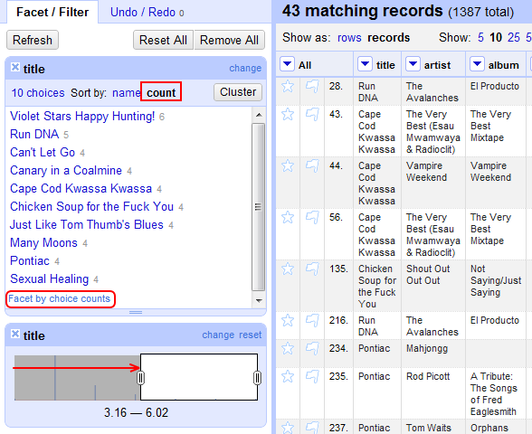
The full results can be had at the above link, include screen shots demonstrating the steps he took to reproduce my music charts without ever leaving Refine. E.g.:

Notice the Facet by choice counts button highlighted in red. I didn’t. It seems to be important.

He also started to look at distribution of albums among episodes, which isn’t something I got into. And made the point that I managed to play one Kleptones track twice in a single episode. I haven’t forgotten that incident, but thanks for the reminder.

I’m not likely to abandon PostgreSQL and SQL-based data mining completely in favour of Refine. Refine is of course not intended as a relational database manager, whereas Postgres can work it’s magic across many linked tables simultaneously. Even for working with a single spreadsheet it’s unlikely that Google Refine (or any GUI-based data mining application) will be able to match the utter data-mashing flexibility offered by SQL. Once you get good at composing SQL queries it can also save a bunch of time, particularly if you’re doing the same kind of querying repeatedly on multiple datasets or multiples facets of a given dataset. Tweaking a word or two in a SQL sentence and pasting it back into the console window is faster than re-clicking a bunch of buttons in the proper order.

On the other hand, there are real advantages to the all-Refine method proven above. Refine is relatively easy to install on your computer and import data into. PostgreSQL is a pain in the ass on both counts. Clicking buttons is intuitive. This is probably the only sentence on the internet containing the words SQL and intuitive. I can imagine some of my friends in journalism and the social sciences becoming very productive with Google Refine’s cleaning and manipulation methods (and they should!). PostgreSQL is probably a bridge too far for most people who don’t spend most of their lives up to their elbows in teh data.

Thanks MagdMartin for demo-ing the possibilities!

Data-Mining My Old Radio Playlists

In which I scrape all my old radio playlists off the web, cook them with Python, Google Refine and PostgreSQL, and discover that I played one heck of a long tail of songs. And J.J. Cale.

A friend from the Ann Arbor years was in town for a conference, and it put me in mind of my radio days. After every show I used to post up a link to the playlist automatically generated by the WCBN server. Like this for example. I was wondering: what could be done with all that DJ Hugonaut data?

I was wondering that, and I also happen to have a lot of idle time at night while I’m on sleeping-baby-monitoring duty. So here we go.

Scraping the Webpages with Python

The first step was to actually get all that data from the web, preferably in some more data-like format than raw HTML. This task is sometimes called ‘scraping‘, which sounds kind of nasty but there you are. There may be better languages for web scraping, but since I started programming in Python I’ve been enjoying coding more than any other time in my life. So Python it is. If you like pressing the tab button, you too might enjoy programming in Python.

Python has built in capabilities for connecting to a website and getting the HTML, but navigating the raw HTML tags for useful info sounds like a terrible idea. An HTML parser was needed. I chose Beautiful Soup on the strength of it’s name. Works great.

Here’s the Python code I wrote for the web scraping job. Please don’t look at it. It was largely written while distracted and occasionally while drunk.

The script starts by connecting to hughstimson.org/projects/djhugo/ and scanning for individual podcast episodes. It extracts a bunch of data about each episode, most especially the link to the playlist on the WCBN server. It sucks down that webpage as well, and rummages through it looking for all the tracks I played that day with their times, names, artist, album, etc.

It organizes all those tracks from all the episodes into a table, and spits it into a big gob of a .csv file.

De-Duping in Google Refine

DJs at WCBN key the name of the track they’re playing into the playlist database as they play it, as well as the artist/album/label. In theory. In practice you’re busy spilling a thermos of cold coffee into turntable 1, and you rarely have time to spell Dilaudid (Marrtronix Version) precisely the same way you did last month, or look up the label that originally released A John Waters Christmas.

So the data quality from my old playlists is not exactly pristine. Enter Google Refine.

Google pitches Refine mostly towards journalists who have to deal with the crummy state of publicly released government records (here’s a compelling example of that pitch). But it’s also useful for former DJs reminiscing about the brilliant sets of their younger years.

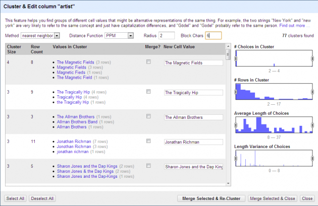
There are a lot of power options in Refine that I don’t know how to use, but the key tool is cluster. Import a file, click on a column, create a ‘facet’, and then when that facet appears press the Cluster button.

Here’s an example of  Cluster suggesting that Tragically Hip and The Tragically Hip might be the same band. This is fundamental.

Google Refine clustering band names

There are a number of cluster algorithms available, and as I ran them against track names, artists names and album names I found they almost all discovered a new set of duplicates. After accepting or rejecting a round of suggestions from each algorithm you can re-run the clustering on the results and see if anything new pops up.

There are a bunch of algorithms for clustering baked into Refine, and most have tweaking options available.  Almost every algorithm I ran surfaced mislabelled entries in my tracks, albums and artists, and most algorithms seemed capable of flagging a different set of mistakes. Once a cluster of entries has been suggested you can quickly pick one name to assign to the bunch of them. Press Merge Selected & Re-Cluster (a very satisfying button) and see what new suggestions emerge. If there’s nothing new, tweak your algorithm or try a new one. Deploy all algorithms. That’s life advice.

De-duplicating of table entries can also be done using the Filter option in Excel, plus a whole lot of scanning up and down the filtered list with your hurting eyeballs. But Refine’s cluster tools saves time, and catches edge cases you likely would have missed if you were depending on alphabetical proximity of sister entries. Even better, the merge & recluster process induces a strong feeling of saving time. This is especially important if you’re ignoring your actual work to play with a vanity project.

Here’s the output:


fullscreen version

Analysis in PostgreSQL

Clean data is fine, but what I wanted was summarization. Mostly I wanted to answer a question that nagged me throughout my tenure as a DJ: was I qeueing up the same 12 songs over and over? Because sometimes when it was 6:40 in the morning and the request line wasn’t flashing and I was dropping the needle on MC5’s Sister Anne yet again it sure felt like I was.

Perhaps pivot tables in Excel could have addressed this question. But since I started using PostGIS to answer geographic posers I’ve been much taken by the speed and flexibility of typing out little SQL words to do magic. PostGIS runs on PostgreSQL so up into the PostgreSQL database went the Refine output.

Results, Finally

With the data loaded into the database, questions can be put to it. Some of those questions follow, with the specific SQL query I used to ask them, and the result.

First off, how many music shows did I do (at least that I remembered to post a playlist for)?

SELECT COUNT(DISTINCT(episodename)) FROM radio

Result: 52

Sounds about right. And just how many times did I press the red ‘play’ button during those 52 shows?

SELECT COUNT(title) FROM radio

Result: 1387

That’s a lot of songs. I repeated some for sure. How many totally different tracks did I play?

SELECT COUNT(DISTINCT(title)) FROM radio

Result: 1118

Damn. Over a thousand different songs. And I promise I only occasionally pulled an album at random off the shelf.

Speaking of which, just how many albums did I draw from?

SELECT COUNT(DISTINCT(album)) FROM radio

Result: 599

And how many different artists did I play?

SELECT COUNT(DISTINCT(artist)) FROM radio

Result: 650

Also a lot. More artists than albums in fact. Presumably that’s because I couldn’t always be bothered to enter an album name, but usually got to the artist field, which came first. And sometimes I was playing some odd bit of internet artifactery and I didn’t know what the hell to write for ‘album’ anyway.

The DJ Hugonaut Charts

Down to details. What were the favourites?

Most-played tracks

SELECT title, artist, COUNT(title) FROM radio
GROUP BY title, artist
HAVING COUNT(title) > 3
ORDER BY COUNT(title) DESC, title ASC
#1 Violet Stars Happy Hunting! Janelle Monae 6 plays
#2 Run DNA The Avalanches 5 plays
#3 Can’t Let Go Lucinda Williams 4 plays
#3 Canary in a Coalmine The Police 4 plays
#3 Chicken Soup for the Fuck You Shout Out Out Out 4 plays
#3 Many Moons Janelle Monae 4 plays
#3 Sexual Healing Hot 8 Brass Band 4 plays

Ah yes, Violet Stars Happy Hunting. They say that album did very well on college radio. I’m to blame.

Most-played artists

SELECT artist, COUNT(artist) FROM radio
GROUP BY artist
HAVING COUNT (artist) > 9
ORDER BY COUNT DESC, artist ASC
#1 J.J. Cale 20 plays
#2 Fred Eaglesmith 17 plays
#2 Janelle Monae 17 plays
#3 Kleptones 16 plays
#3 The Mountain Goats 16 plays
#4 Neil Young 15 plays
#5 Lucinda Williams 13 plays
#5 Mike Doughty 13 plays
#6 Merle Travis 12 plays
#6 Tom Waits 12 plays
#7 Danko Jones 11 plays
#7 Jonathan Richman 11 plays
#8 Bob Dylan 10 plays
#8 Go Home Productions 10 plays

How I miss broadcasting J.J. Cale to the Ann Arbor and greater Ypsilanti region.

Fred Eaglesmith, Lucinda Williams, Merle Travis — I’ve forgotten how much country I played. I don’t like country I swear. Just the awesome parts. And Merle Travis I suppose.

Most-played albums

SELECT album, artist, COUNT(album) FROM radio
GROUP BY album, artist
HAVING COUNT (album) > 5
ORDER BY COUNT DESC, album ASC
#1 Metropolis Suite 1: The Chase Janelle Monae 17 plays
#2 Live’r Than You’ll Ever Be Kleptones 11 plays
#3 Rockity Roll Mike Doughty 9 plays
#4 Fred J. Eaglesmith Fred Eaglesmith 7 plays
#4 The Complete Bootlegs Go Home Productions 7 plays
#5 Car Wheels On A Gravel Road Lucinda Williams 6 plays
#5 Not Saying/Just Saying Shout Out Out Out 6 plays
#5 Southern Roots Jerry Lee Lewis 6 plays
#5 The Essential Taj Mahal 6 plays
#5 Vampire Weekend Vampire Weekend 6 plays

Again with the Janelle Monae. Metropolis Suite 1: The Chase was no doubt the album I played the most from, but it only made it to the top of this particular list thanks to Refine’s ability to resolve a lot of different ways to spell the same album name while stashing vinyl in slip covers and qeueing the emergency broadcast test.

Live’r Than You’ll Ever Be made the list because the tracks on that album bleed very sweetly into each other. Thus if you need to walk out of the studio for a fire alarm or smoke break you can count on a solid hour of self-transitioning music. There’s a tip for you.

The Long Tail

So those are the charts. What I find surprising about them is how little play those top plays got. For example: the top 10 albums collectively contributed only 6% of 1400 plays. And that includes The Essential Taj Mahal.

Here’s the frequency of track play frequencies:

SELECT titlecount, COUNT(titlecount)
FROM (SELECT COUNT(title) AS titlecount
      FROM radio
      GROUP BY title, artist)
      AS subquery
GROUP BY titlecount
ORDER BY titlecount DESC
# of plays # of tracks played that many times
6 1
5 1
4 5
3 37
2 152
1 941

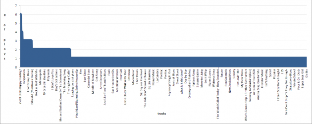
And let’s see that data in traditional long-tail layout.

SELECT title, artist, COUNT(title) FROM radio
GROUP BY title, artist
ORDER BY COUNT(title) DESC

track play frequencies

Yes by god, that is a long tail.

Sure I had some crushes on a few tracks, but 68% of my airtime was made up of 941 tracks that I queued up once and never again. I guess I could have gotten away with a few more repeats after all. Next time: all J.J. Cale, all the time. That will be good radio.

Embedding a Fusion Table map in a WordPress post

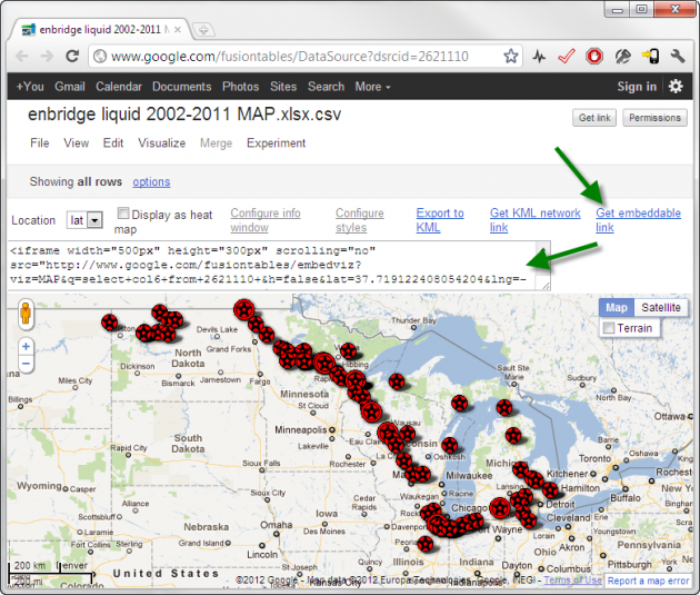
Just testing: a Google Fusion Table map embedded in a WordPress blog post.

Here’s the original Fusion Table table. That data is described in this Ottawa Citizen post by Glen McGregor.

Here’s the exact embed code used for the above map:

<iframe src=”http://www.google.com/fusiontables/embedviz?viz=MAP&q=select+col6+from+2621110+&h=false&lat=43.50124035195688&lng=-91.65871048624996&z=5&t=1&l=col6″ scrolling=”no” width=”100%” height=”400px”></iframe>

That’s just the default output from the Fusion Table map visualization, with the minor exception of tweaking the height and width a bit to fit my post. That code is available from within the Fusion Table visualization page if you click the “get embeddable link” link. Here’s a screenshot:

I’m posting this because someone was having trouble with this process and I wanted to try it out myself. I didn’t have to make any modifications to my existing WordPress 3.3.1 installation or theme to get it working.

Please note however that there is still a Conservative majority.

Update (later the same day): I’m pleased to see that Glen McGregor was able to embed the map on the the Edmonton Journal site, and wrote a telling article around it.

I Refuse to Blog Under A Conservative Majority

Just kidding.

It’s a documentary! It’s all really happening!

Hotham Sound Kayaking Review

jane's review and taping procedure

Recommended.

A Moderate Shift in Canadian Voting

The parties’ seat distribution matters for the four years between elections, and this past election generated a significant shift in seats. The popular vote will also matters for those four years as the parties try to align their policies with their understanding of the voters. After that comes the 2015 election, where seat distribution will be meaningless and popular vote will once again mean everything. So let’s not forget the popular vote in our collective, well-justified consternation around seats.

Here’s the popular vote from 2008 and 2011:

These changes may have tipped a lot of first-past-the-post riding outcomes, but in themselves they are moderate shifts.

I’ve read a few articles from a range of politicos stating or implying that Canadians must broadly support the Conservatives’ conservative politics, given that they “just won the election” (see here for a fresh example). Yes, but without the actual support of the actual majority of voters, and with little improvement over their last lukewarm endorsement. And if you believe the post-election focus-grouping, even the people who voted Conservative aren’t especially motivated by conservativism. This will be a trying four years, parliamentary process being what it is. But the left won’t be any stronger through those years if it forgets that it represents the significant majority of Canadians’ values. That’s not a trivial factoid, that’s a baseline fact.

And how about that “historic collapse” of the Liberal party? From 26% to 19%. A shift of one voter in 14.

If you follow the parliamentary trend over the last few years you could be forgiven for thinking that we’ve seen a entrenchment of conservative values in Canadian politics, and now a massive re-arrangement of centre-left party politics. I think what we’ve seen is parties luffing their sails in the fickle winds of minority politics, some slight shift in Canadian voting, and very little shift in actual Canadian values. Those votes and those values are what will matter in the long run, even if the short run is a sorry mess.

See previously: Plus Ca Change

older posts